< Return
Twickets
Opportunity Statement
Twickets is struggling to gain a bigger share of the secondary-ticket market despite the initial growth of it’s user base. This case study is going to investigate whether there is a user-centred issue contributing to Twickets’ growth barrier and if so, find solutions to the discovered pain points.
Research Approach
As this project had a time scale of 8 weeks and minimal resources, the initial strategy was to perform remote 1-to-1 user interviews. While preparing to conduct the user interviews other secondary research was conducted allowing the research conclusions to be derived alongside each other after the interviews.
User Interviews
The question strategy for the user interviews was to focus on understanding how users are finding the platform, what their expectations are, how those expectations are being satisfied and when they are not using the platform, understanding why they are using alternatives.
Affinity maps were then used to code the users' responses into themes to understand how the platform is viewed. I like to use affinity maps to avoid introducing any of my own assumptions into the research process, the format allows themes to grow organically and exposes any outlying responses. Once responses had been clustered together ten key themes emerged. Some of the themes found were less supported than others but a basis for developing a stronger user experience emerged.
Raw User Responses
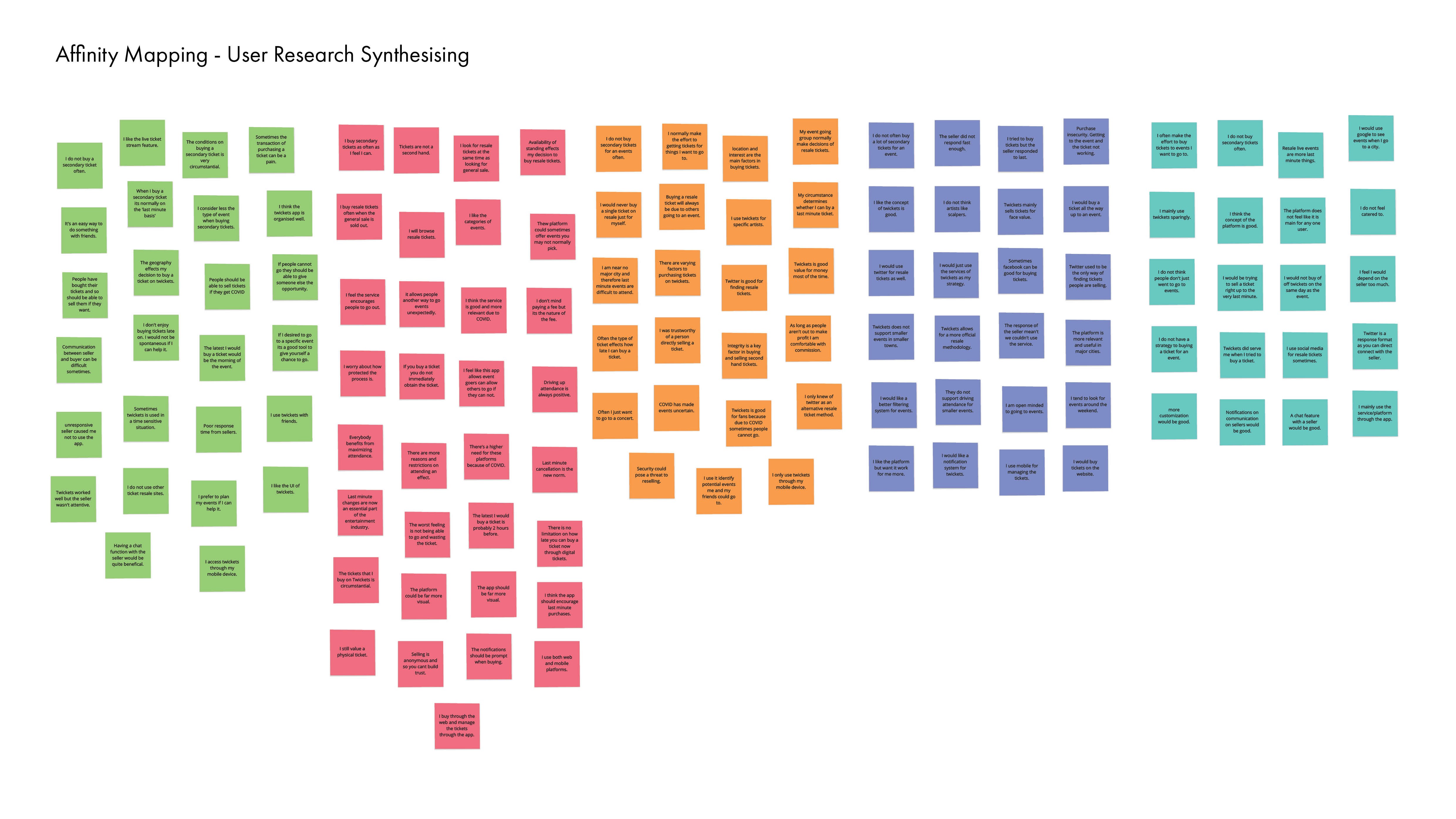
Collective
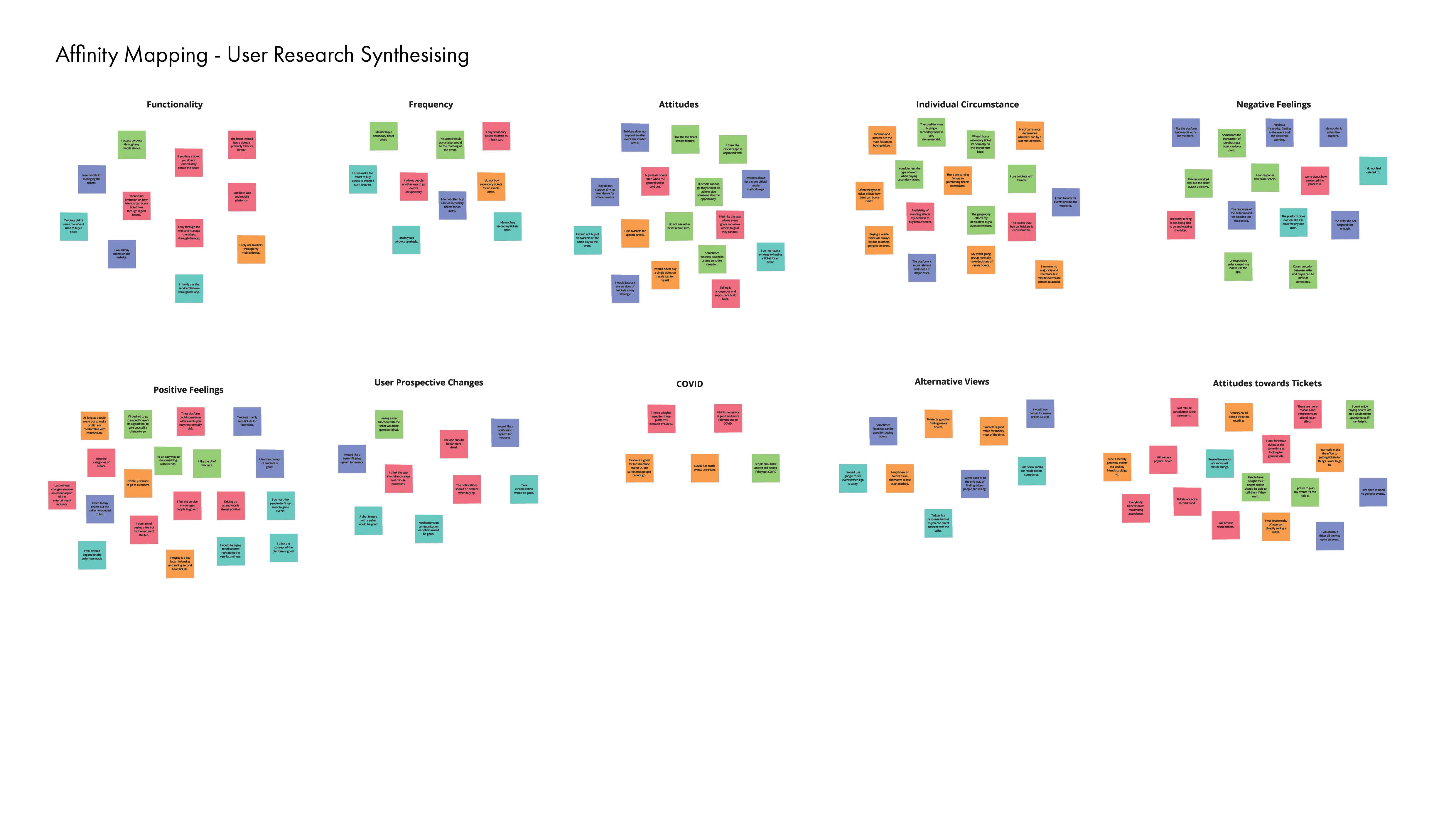
Identified Experience Issues
Single Case Situation - Single Case Situation emerged as a crucial theme during the interview round. The users said that the reasons behind purchasing secondary tickets varied extensively in diverse scenarios. Users also expressed a lack of efficient means to relay their unique situation to the platform.
Prospective User Additions - This point revolves around the prospective adaptations users recommend for the platform. The majority of these revisions pertain to enhancing customization and improving the service to better cater to individual user scenarios. This may not align with the problem statement's direction but will be taken into account.
Substitute Platforms - Twitter emerged as a frequent alternative service highlighted by many users, owing to its user-friendliness and direct seller contact. Users appreciated the ability to connect directly with sellers and take control of the ticket buying/selling process.
Perceptions of Secondary Tickets - The common perceptions towards Twickets mirror those associated with general secondary ticket sales. Concerns centered mainly around the security of receiving the purchased ticket, infrequent opportunities to buy single resale tickets, and the need for spontaneity for last-minute ticket purchases. These points stand as areas for improvement in the secondary ticket industry, rather than pitfalls of Twickets.
Mapping The User Journey
The user interviews provided an insight into key user frustrations but these alone do not represent the entire experience. Based on the user responses a typical user journey was mapped out to better understand the emotional experience of the user.
Mapping the journey like this provided a visual way to see what was going wrong. Users enter the experience with high motivation and excitement but this is only equalled in the event of the user acquiring a ticket. This proves the more holistic task of this redesign will be in better managing each stage of the experience to lessen the decline in positive emotions. Though it would be unrealistic to be able to mitigate users not being able to acquire tickets it is achieveable to better optimise the user journey.
Modelling User Needs
I always use user personas to help bring the user journey to life, it helps to build an empathic view of how the user arrives to the product and deepen an understanding of what they need from the product. It also supports the design phase as a point of contact to link back to the user as sketching and wireframing can sometimes feels as if they take you away from the user.
Design Goals
After the initial research was conducted How Might We statements where defined. How Might We statements leave the design phase open ended and promote a creative environment.
How might we use the information gained about the user’s relationship with the seller to better the platform?
How might we take the considerable concerns about individual circumstance users have and better optimise the platform?
How might we use the information users have described about Twitter to generate a better experience on Twickets?
How might we take the pain points users have and improve the user experience so that general experiences are better to aid the growth of the platform?
Design Approach
My design approach was to begin with pen and paper, I find it's more conducive to developing creative ideas. Once I established an array of ideas I refined and merged ideas to come to the best possible solution, at that point I then began developing higher fidelity versions of the concepts.
Initial Pen to Paper
When bidding or ‘offering’ for a ticket, the bid is sent to the seller and the journey is then diverted away from the platform. With this proceeds a repetitive and unproductive cycle of receiving the response through email and then re-bidding after resigning into the app without not ever knowing the acceptable price. To resolve this a form of direct communication will be implemented into the ‘bidding’ process to allow the buyer and seller a more prompt outcome and concise process. This should introduce a better sense of a negotiation phase for both parties, so that the process always feels like it’s progressing.
Secondly, when using the app specific journeys are interrupted by a logging in screen. This problem is illustrative of a wider issue that is the underdevelopment and integration of a user’s account within the service. The account page offers more information about the app rather than the individual and the identity of the person does not extend further than an email address. This not only provides a lack of identity for a user but adds to trustworthy issues as everybody using the app is anonymous. To resolve this the account page will be re-designed to be user reflective and negate interruptive login pages, this will include more information about the user as well as reputation metrics to build trust between users on the platform similar to other secondary goods platforms.
Thirdly, users reported poor performance and inattentiveness towards circumstance around their ability to buy tickets from the app. Users reported that the scenario regarding a ticket was vital to buying a ticket. As it stands the current version offers a filtration system on it’s pages that do consider the user journey and is present as a passive feature. To resolve this user circumstance will be acknowledged as part of the user journey and the filter feature will be redesigned into the journey to accommodate that. Further to that point the landing page currently does not serve the user as the categories to which events are promoted are not the ways in which users make decisions on the app. Genre Listed and Less than face Value are not things that influence users . However, the area based category does and should remain. Therefore to resolve this the Explore and Ticket Stream pages will be re-designed to better serve the user.
Fourthly, the app currently over emphasises its trustworthiness, security and legislation around buying secondary tickets to the extent it makes users skeptical of it’s services. It has been addressed previously how this will be bettered in certain aspects of the design but some aspects of the UI are not currently indicative of safety. Therefore this final point more broadly covers an overall strive to better the UI for the purpose of user security and feeling of safety.
Refining Individual User Flows
Exploring the possible solutions in medium fidelity often helps to clarify the direction of the concept and better question its viability.
In order to retain the user on the platform and keep the entire experience contained within the service I began to more thoroughly wireframe how users were going to be able to communicate ticket transactions and how best that would be achieved.
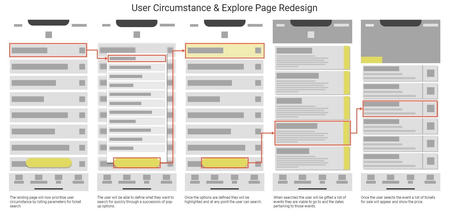
My initial thoughts behind an improved user search was formulated into a higher fidelity wireframe to better conceptualise the how users were going to better find tickets. This brought me to questioning how the information was going to be structured to best suit the users' needs.
A card sorting activity was conducted to better formulate a hierarchy for the explore page. Factors related to buying secondary tickets that were mentioned in the user interviews were added to page where participants had to group and order them in terms of importance. This produced a clear hierarchy that could be implemented into the design of the new search page.
Elevating Brand Identity
Addressing the identity of the brand was not within the initial scope of the project. Though after initial sketch work and design thinking a lot of the current issues with hierarchy stemmed from it's poor use of colour. The platform used a lot imagery and sporadic colour to separate assets but it didn't tie into the brands identity. This made it difficult to assign a level of importance to assets within the experience.
Old Colour Palette
Revised Colour Palette
Therefore using the existing colour scheme as a base, a few more colours were introduced which helped derive a better hierarchy in different pages of the application and heighten the level of importance of specific call-to-action buttons.
Developing a Prototype
An interactive prototype was the predominant deliverable for this project so ensuring that it communicated all the recommended design changes was vital. Using low fidelity wireframes and the existing application different parts of the experience were built out to give the prospective user a sense of how the design changes would improve the holistic experience of the app.
The prototyping process for this design was extensive as having the majority of the assets on a ticketing application interactable was key to build a sense of emersion which helps convey the value of the design changes. This meant that most of the tickets had to be embedded into the flow of the prototype and there could not be any dead ends.
This resulted in a complex framework of connecting assets which was time intense to achieve. During any project it is essential to have a grasp of what would be most valuable for the final outcome and although building the prototype in this way took some time the fidelity of the outcome achieved largely helps to communicate the value of the design changes.
Final Outcome
Following the research and design development the final outcome of this project was an interactive prototype, a series of high fidelity mock-ups supported with key improvements and a revised user journey. Structuring the deliverables in this way brings clarity to what would be suggested from a product development perspective to enable Twickets to build a larger stake in the secondary ticket market.
Old Design
New Design
Final Design Features
A search engine with targeted filter criteria relevant to the user’s circumstance.
A ticket stream with an accessible alert system.
An exchange centre that allows users to buy and sell in one place.
A personal reputation system to encourage frequent engagement.
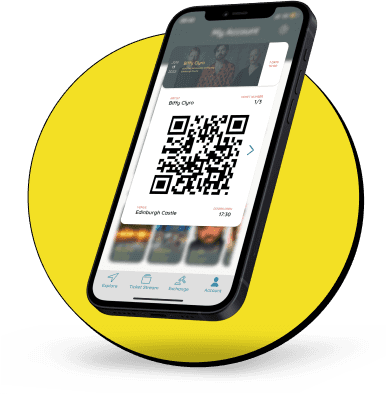
An in-app wallet that means the user only has to use the app to go from search to event entry.
How does this effect the User?
After completing the redesign of the product it is important to return to the broader user journey to understand how the changes to the platform have effect what the users emotional experience.
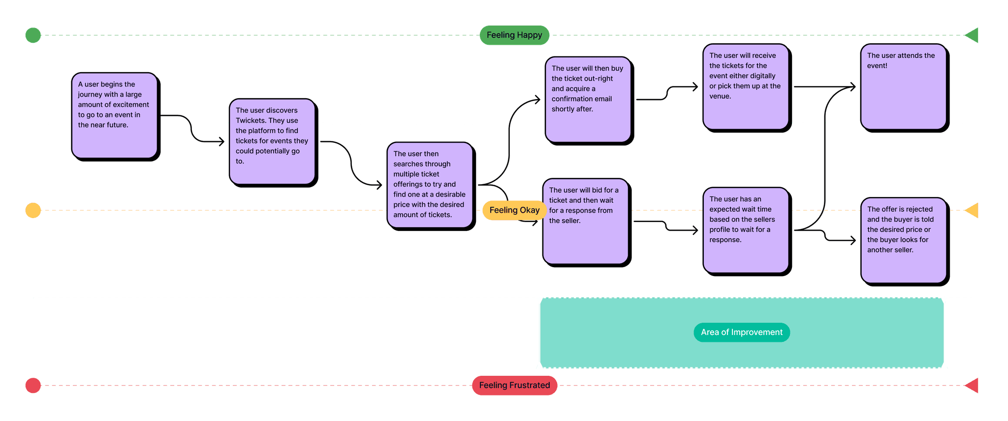
As evidenced above the improvements to the product should provide an area of improvement to the pursuit of a ticket via the bidding system. The amendments should make communication between the buyer and seller more concise. The disappointment of not getting a ticket cannot be removed from the experience but we can transport the user faster through the product journey to make them feel less time has been wasted.
Key Achievements
Search Optimisation
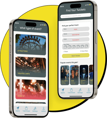
The original platform’s front page was structured with a hierarchy that fed into a bad user experience, research found the conditions which tickets were shown did not align with what was important to the user. The revised landing page can now be seen as a ‘search’ page instead of an ‘explore’ page, this was because users wanted to search for a ticket on the platform similarly to searching for a book in a library and not like browsing a specials menu at a restaurant.
In-App Experience
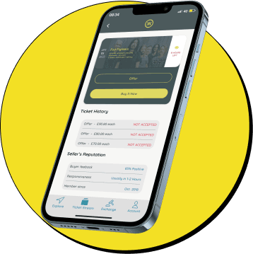
A key flaw of the original design was that tickets were secured through email rather than embedded into the platforms user journey. This led to a lot of user insecurity as users felt like they were being diverted away from the site at the point of purchase. The design addresses this by keeping the entire experience within the platform by creating direct user to user interaction through the platform resolving users concerns of trustworthiness.
Ticket Storage
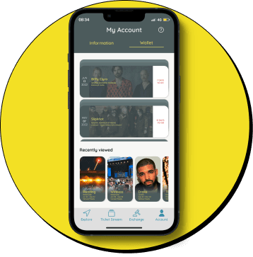
Research shown ticket security was a large concern for users as with the majority of ticketing becoming digital there is no physical purchase. An in-app wallet was formed so users feel their purchase is more meaningful by having immediate feedback rather than having to wait for an email from the seller.
Prototype
Key Learnings
Evolving Existing Products - Evolving an existing product was a valuable learning experience as I found that having a product to reference was beneficial in maintaining the scope of the project. Also designing within a brand identity allowed me to focus more of my efforts on particular areas of the user journey.
Building Prototypes - Building a prototype for a ticketing platform was a good learning experience as I found to create the level of emersion desired a lot of the assets present had to have a level of interactivity which was a considerable task. Though I found being challenged to build a prototype at this level of depth improved my prototyping work flow and prioritisation of feature building.
Designing the Details - Designing within an existing product allowed me to focus on the details of the platform rather than developing broader user flows. This meant that I could spend more time ensuring a feature was properly embedded into a product and was appropriately designed rather than just being present.


